פרק 8 - ggplot
החבילה ggplot2 מסייעת להציג מידע בצורה גרפית
# install the library ggplot2 if it is not already installed
if (!require("ggplot2")) install.packages("ggplot2")
# load the library ggplot2
library("ggplot2")דוגמא 1: QQplot לצורך בדיקת הנחת הנורמליות בשתי קבוצות (שני גרפים זה לצד זה)
if (!require("ggplot2")) install.packages('ggplot2') # for data visualization
if (!require("tidyverse")) install.packages('tidyverse') # dealing with dataframes
if (!require("tidylog")) install.packages('tidylog') # logs for tidyverse
if (!require("plotrix")) install.packages('plotrix') # for the standard error function
songsDataset <- read.csv('songs.csv') # read the dataset CSV file
songsDataset <- na.omit(songsDataset) # to remove NA values if there are (makes no change)
# new categorical column "explicit_text" to translate the binary column "explicit"
songsDataset <- songsDataset %>%
mutate(explicit_text = case_when(
explicit == 0 ~ "Implicit",
explicit == 1 ~ "Explicit",
))
# summary table that holds descriptive statistics about the variable popularity:
# mean, sample size, standard deviation, standard error of the sample and median
# for both groups - Explicit songs and Implicit songs
stats_popularity_per_type <- songsDataset %>%
group_by(explicit_text) %>%
summarise(popularity_mean = mean(popularity),
n=n(),
std = sd(popularity),
sterr = std.error(popularity),
median = median(popularity))
# simultanious qqplot for the variable popularity in both Implicit & Explicit songs
ggplot(songsDataset) +
geom_qq(aes(sample = popularity, color=explicit_text), size=1) +
geom_qq_line(aes(sample = popularity)) +
facet_wrap(~explicit_text, ncol = 6, shrink = TRUE) +
guides(color='none') +
labs(x='Theoretical Z score', y='Popularity',
title = 'QQplot for the variable popularity in both Implicit & Explicit songs',
subtitle = 'To check the noramality assumption on each group') +
theme(plot.title = element_text(color="grey20",size=14, face="bold.italic"),
plot.subtitle = element_text(color="grey20", face="italic"))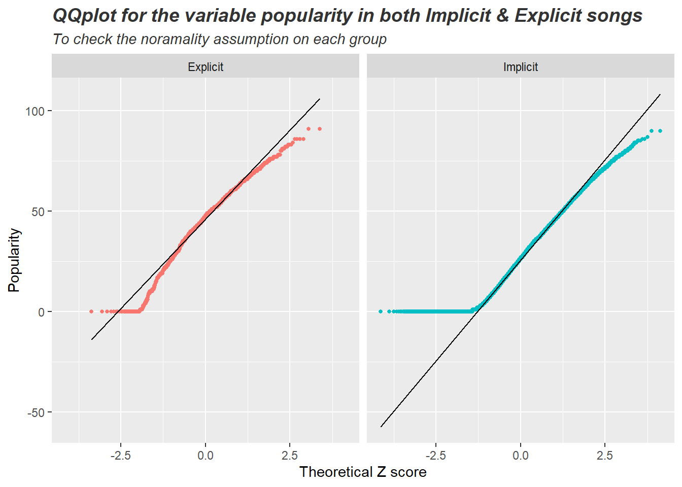
דוגמא 2: הצגה ויזואלית של מבחן t למדגמים בלתי תלויים + סטטיסטיקה תיאורית
ggplot(songsDataset, aes(x=popularity, fill = explicit_text)) +
geom_density(alpha=0.5) +
geom_vline(data = stats_popularity_per_type,
aes(xintercept = popularity_mean), linetype="dashed") +
geom_text(data = stats_popularity_per_type,
aes(x = 87.5, y = 0.03, label = paste('N:', n),
color = explicit_text),
size = 4) +
geom_text(data = stats_popularity_per_type,
aes(x = 87.5, y = 0.025, label = paste('Mean:',round(popularity_mean,2)),
color = explicit_text),
size = 4) +
geom_text(data = stats_popularity_per_type,
aes(x = 87.5, y = 0.02, label = paste('Median:',round(median,2)),
color = explicit_text),
size = 4) +
geom_text(data = stats_popularity_per_type,
aes(x = 87.5, y = 0.015, label = paste('Std:',round(std,2)),
color = explicit_text),
size = 4) +
geom_text(data = stats_popularity_per_type,
aes(x = 87.5, y = 0.01, label = paste('Sterr:',round(sterr,2)),
color = explicit_text),
size = 4) +
facet_wrap(~explicit_text, ncol=1) +
guides(color='none', fill='none') +
scale_fill_manual(values = c('cornflowerblue', 'darkgoldenrod')) +
scale_color_manual(values = c('cornflowerblue', 'darkgoldenrod')) +
labs(title = 'Is there a difference in popularity between Explicit and Implicit songs?',
subtitle = 'each vertical line represents the sample mean',
y='Density',x='Popularity grade') +
theme(plot.title = element_text(color="grey25",size=13.5, face="bold.italic"),
plot.subtitle = element_text(color="grey25", face="italic"))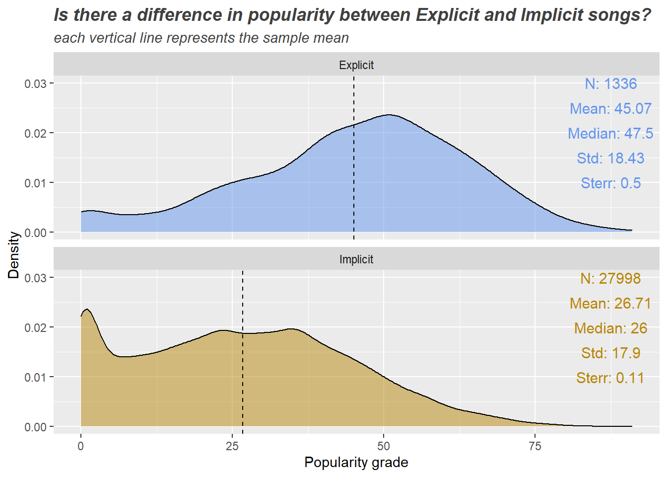
דוגמא 3: QQplot לצורך בדיקת הנחת הנורמליות באחת עשרה קבוצות (11 גרפים זה לצד זה)
# extract the year, century and decade
songsDataset = songsDataset %>%
# extract only the 4 digits represents the year - 1996, 1956, 1977 etc
mutate(release_year = str_extract_all(release_date, "\\d{4}")) %>%
# 1900s, 2000s
mutate(release_century = paste(substr(release_year,1,2), '00s', sep='')) %>%
# 1920s, 1950s, 2010s, etc
mutate(release_decade = paste(substr(release_year,1,3), '0s', sep='')) %>%
# make sure the data is OK. songs should be from 1922 to 2021
filter(release_year >= 1922 & release_year <= 2021)
# summary table that holds descriptive statistics about the variable tempo:
# mean, sample size, standard deviation, standard error of the sample and median
# for all decades - from 1920s to 2020s
stats_relase_decade_and_tempo = songsDataset %>%
group_by(release_decade) %>%
summarise(tempo_mean = round(mean(tempo),2),
n=n(),
std = round(sd(tempo),2),
sterr = round(std.error(tempo),3),
median = round(median(tempo),2)) %>%
# order the stats table by the decade
arrange(release_decade)
# simultaneous qqplot for the variable tempo in all decades
ggplot(songsDataset) + # it takes some time to run... a lot of data to process
geom_qq(aes(sample = tempo, color=release_decade), size=0.5) +
geom_qq_line(aes(sample = tempo)) +
facet_wrap(~release_decade, ncol = 6, shrink = TRUE) +
guides(color='none') +
labs(x='Theoretical Z score', y='Tempo',
title = 'QQplot for the variable tempo in all decades',
subtitle = 'To check the noramality assumption on each group') +
theme(#aspect.ratio=1,
plot.title = element_text(color="grey20",size=14, face="bold.italic"),
plot.subtitle = element_text(color="grey20", face="italic"))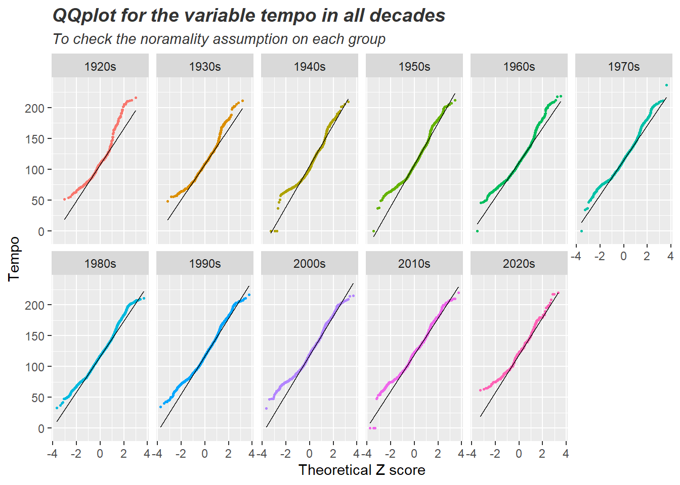
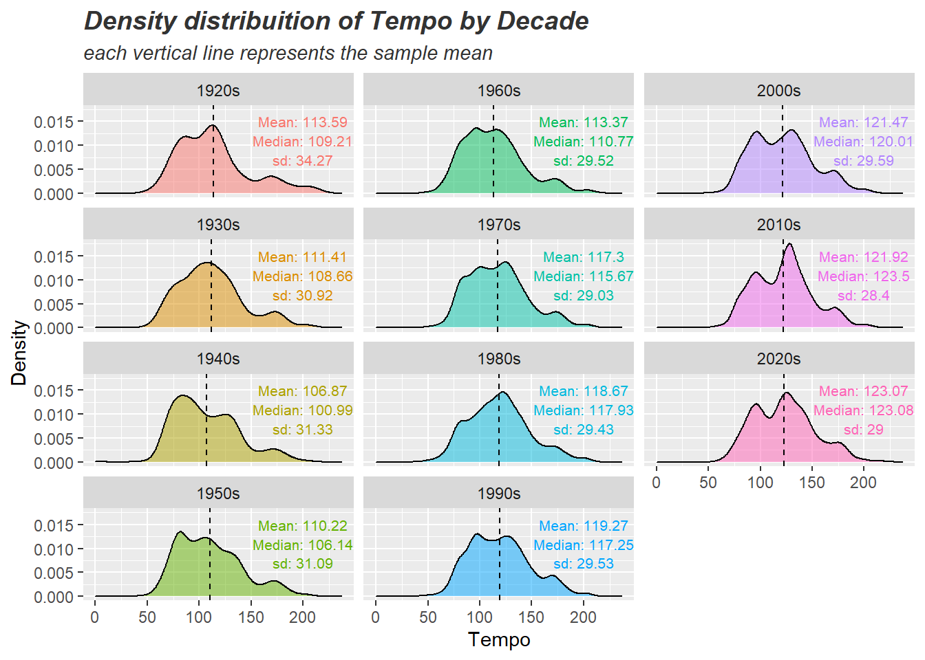
דוגמא 4: הצגה ויזואלית של ניתוח שונות חד גורמי עם 11 קבוצות + סטטיסטיקה תיאורית
ggplot(songsDataset, aes(x=tempo, fill=release_decade)) +
geom_density(alpha = 0.5) +
facet_wrap(~release_decade, ncol = 3,shrink = TRUE, dir="v") +
geom_vline(data = stats_relase_decade_and_tempo,
aes(xintercept = tempo_mean), linetype="dashed") +
geom_text(data = stats_relase_decade_and_tempo,
aes(x = 200, y = 0.015, label = paste('Mean:',round(tempo_mean,2)),
color = release_decade), size = 2.8) +
geom_text(data = stats_relase_decade_and_tempo,
aes(x = 200, y = 0.011, label = paste('Median:',round(median,2)),
color = release_decade), size = 2.8) +
geom_text(data = stats_relase_decade_and_tempo,
aes(x = 200, y = 0.007, label = paste('sd:',round(std,2)),
color = release_decade), size = 2.8) +
labs(x = 'Tempo', y='Density',
title = 'Density distribuition of Tempo by Decade',
subtitle = 'each vertical line represents the sample mean') +
guides(color='none', fill='none') +
theme(plot.title = element_text(color="grey20",size=14, face="bold.italic"),
plot.subtitle = element_text(color="grey20", face="italic"))